Hotel Performance and Insights feed

Alexander Fanden
Lead Product Designer
34 Min Read · Design Insight
Introduction
The YCS app is an enterprise tool launched in early 2018 where hotels can manage rates and allotment, bookings, promotions and much more. In 2019, our goal was to build out some wanted features on the app such as providing an overview of hotel performance and operations, thus enabling hotels to make better decisions and accelerate their business with Agoda.
To get a better understanding on where to focus our efforts at, we conducted research by interviewing with hoteliers in our key markets to get a better understanding of their wants and needs. After talking to our users, it became clear that we weren’t providing sufficient insights on how the hotels performed. The current way for hotels to get insights was via monthly meetings with a Market Manager from Agoda, who would bring a printed monthly report and discuss areas of improvements face-to-face. While this report was appreciated, it didn’t provide all the data our hotels wanted, and it didn’t allow them to customize the way they needed. By providing a more flexible way to generate these insights, we believe that hotels would be able to make better decisions. And we would also reduce the labour-intensive process of printing reports and visiting hotels.
I lead the design of the overall app experience throughout this project, working together with a UX Researcher, Copywriter, Prototyper, Product Owner and a team of Developers and QA Engineers.
Initial research
In order to understand what data our hotels needed and which tasks they normally performed, we immersed ourselves into the daily tasks of the hotels and their staff. Not all hotels operate the same way but we targeted specific hotels in our biggest markets from the data of active users on both app and desktop. With the help of local Partner Services teams, we scheduled visits to small family-run boutique hotels in Taichung, Taiwan to larger chain hotels in Cebu, Philippines.
We took note of common tasks they performed during a day, observing how they interacted with our systems and what data was most valuable for them, and interviewed the staff to understand how and when they used our system. They were also asked to rank different features and data by importance, using card sorting.
The findings were consolidated and the most wanted features across the different types of hotels, markets, and roles within hotels were mapped out—It became clear that different roles have different needs:
- For Decision Makers, it was important to get insights on hotel performance, in order for them to make strategic decisions.
- For Operational Staff, they would like to get a good overview of what’s going on at the hotel.
Diving into the data
We decided to focus on the Decision Makers as we weren’t catering to their needs at all at the time whilst Operational Staff already had the tools they needed on YCS.
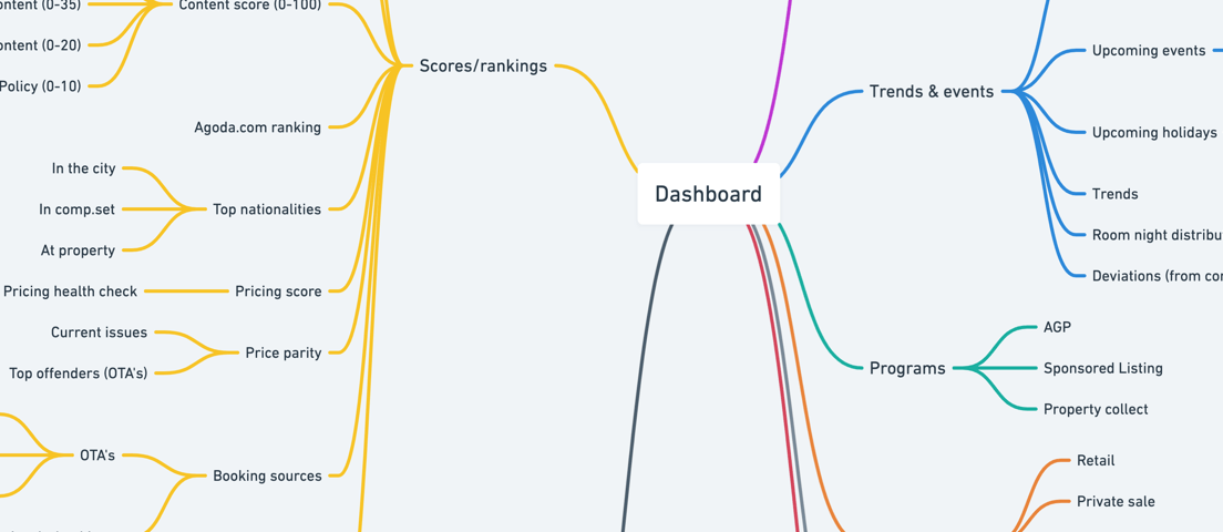
I created a mind map of all scores, metrics, events and other interesting pieces of information that might help hotels make better decisions. It included data that we already had, data that was requested by our hotels, data that our competitors provided and some new ideas. While the different data points might provide some useful information on their own, we believed that we could generate more meaningful insights by combining them. Inspired by how Google Analytics lets you generate reports, I grouped the data into different categories as a formula:
- Metrics (such as bookings, room nights, revenue)
- Dimensions (such as nationality, promotion type, traveller type)
- Time frame (e.g. today, this week, last month)
By comparing the data using other dimensions or time frames, we could generate new insights.
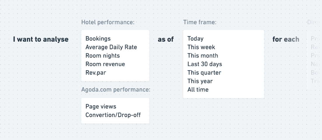
For example, if a hotelier analyses her bookings for the last 30 days for each nationality, compared to her competitors, she might find that her property attracts a significantly lower number of guests from the Japanese market. At this stage, our new tool can provide suggestions by looking at her hotel, their competitors and trends for Japanese travelers. There might be certain amenities that are important for Japanese travelers, which her hotel doesn’t provide. With this insight, she can take action immediately.
EARLY EXPLORATIONS
With the potential data points defined and a formula to generate insights, we started with some initial concepts. We wanted to cater to both our key user groups from the get-go—the decision makers and the operational staff. Therefore, we came up with a homepage that displayed both performance-related data and activities at the hotel.
At the time, the landing page of our app was a very basic feed of generic suggestions. The engagement was low and our users were reluctant to take the suggestions, so we decided to replace this feed altogether with our new solution.
The first concept we wanted to try out was a dashboard with two tabs:
- Performance: Hotel scores, performance metrics, competitors and more.
- Operations: Information on new bookings, cancellations, guest messages, reviews and more.
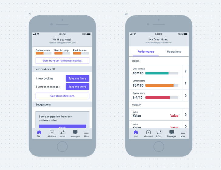
Based on the wireframes, I mocked up high fidelity designs and created a simple prototype for testing. We invited more hotels and let them play around with both solutions. The renamed tab didn’t help the users discover the tabbed navigation. However, when we provided all the content within the same page, we noticed that hoteliers instantly started to scroll the feed to find out more. In this design, we provided filters based on the type of content: Performance, Bookings, Messages etc. Almost all participants tried to interact with these filters.
Our assumption was that this would be the clearest way to group the content since there was such a clear distinction between our users. We renamed the tab “My feed” and designed an alternate layout that combined the performance and operations into one page.
With these insights, we decided to move forward with the one-page solution.

Conclusion
Moving between different levels of fidelity when designing is key. Low fidelity wireframes work great for quick iterations of different concepts and idea generation. However, when performing usability labs, it proves useful to use a prototype that is as realistic as possible.
- Hi-fidelity mockups remove distraction and questions on how the real product would look like and work. Non-designers might have a hard time to imagine how to interact with a product by looking at a set of wireframes.
- Allowing real gestures reduces the risk of errors and makes it easier to understand what the user intends to do with the prototype. For example, if you’re designing a UI that affords swiping, make the element swipeable in the prototype.
- Use real data whenever possible. We didn’t have enough time to customize the content of our prototype to each hotel, and this caused them to focus on things that we didn’t care about from a design perspective. Despite using the right currency and hotel names, we noticed that some hotels were distracted by by certain metrics (“This seems wrong, are these really my rates? Is this really my revenue over the last month or is it quarterly?”). We believe that some aspects of our prototype might have performed better if all the numbers were real, as they would be able to connect the dots quicker and provide feedback on the utility of the designs rather than the accuracy of the numbers.
After talking to 15-20 hotels, we noticed that some hoteliers are used to crunching numbers and analyzing their performance regularly and use it as a basis for their business decisions. Others tend to play by ear. In general, the first group would understand how to read the graphs, analyze the numbers and make sense of the prototype. The second group sometimes struggled with abbreviations, legends for graphs and more. We knew we wouldn’t be able to cater to both groups, at least not in the near future, and therefore we had to make a decision - do we cater to the savvier users, or do we simplify it so that everybody can understand it?
When we interviewed the users, we asked them about our competitors and how they use their tools. The less savvy users did not use any of their performance tools today - therefore it’s unlikely that they would use our tool in the future. Based on that we decided to cater to the savvier users.