Hi there! Welcome to the Agoda brand.
Our Agoda logo has been specially crafted to embody and convey our brand personality, and as such, we require you follow these rules when using it:
- Comply with our guidelines as laid out below
- Do not modify the logo in any way. This includes not rotating, editing, accessorizing, or recoloring it
- Do not use previous versions of the logo
Download Agoda Logos
| LOGOS
The Agoda logo comprises a word mark and a graphics mark of five circles. These elements are usually vertically stacked. The logo can also be stacked horizontally when space is limited and interferes with legibility, or wherever it is a better fit with the aesthetics of the item being designed.
Download |
 |
| When using the logo, there are certain placement requirements to keep in mind, whether designing graphics or simply adding the logo to a Word document.
SPACING
Wherever you use the logo, it must not be crowded in by other elements. To make sure you’ve left enough space around the logo, leave at least the diameter of one Agoda circle clear above, below and to the sides of it. |
 |
|
The circles mark should be a circle’s width from the “Agoda” word mark when stacked vertically and half a circle’s width when stacked horizontally. |
| The logo—its elements, colors, and proportions—should not be changed for any reason, or used in a way that makes it hard to read. |
| Logo with partners
When pairing our logo with a partner logo, put the Agoda logo first, followed by the partner logo, separated by a width of three Agoda circles and a vertical line at the midpoint. |
 |
| Logo on Color Backgrounds
Please use discretion when applying
a colored background, and always
aim to create a high contrast
between the logo elements and the
Background.
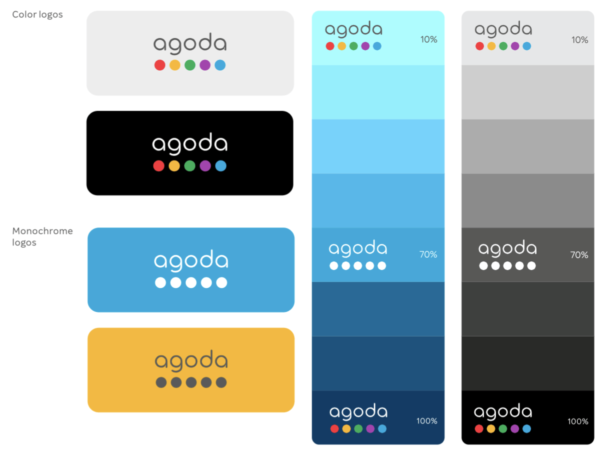
- When the background is a primary Agoda color of more than 10% intensity, the reverse (all-white) logo should be used.
- As background intensities close to 100%, the reverse word mark can be used with the full-color circles mark.
- When the background is too similar to one of the circles in the full-color logo, use either the gray or white monochrome logo—whichever creates the most contrast.
|
 |
| What not to do
The logo—its elements, colors,
and proportions—should not be
changed for any reason, or used in
a way that makes it hard to read. |
 |
| COLORS
The Agoda brand colors express
our diversity, vivacity, and fun-
loving attitude.
There are six primary colors—
these are the only ones you
should use in our logo. |
 |
Our secondary colors give you
a palette to work with when
creating artwork, or even just
putting together a presentation.
These colors are pre-loaded into
PowerPoint and Word. |
 |


